Visual attention is a precious, limited resource. Despite being exposed to scenes and stimuli right in front of our noses, we never see or grasp the entire scene.
Secrets of eye-tracking
Some of these attention losses are merely due to random neural fallouts, while other attention drops are due to systematic biases in our brains. For example, in his article “The 6 Secrets of Eye-Tracking”, Dan Hill (2010) names the bottom right corner of ads as the Corner of Death:
“Avoid the corner of death (…) whether it be a TV screen, a web site page, a print ad, direct mail piece, or billboard. (…) Fully 42% of the advertising we've tested over the years places either the primary logo/brand identity there or else it's the only place where the logo/brand identity appears."
Dan Hill, “The 6 Secrets of Eye-Tracking”
What's so bad with that, you ask? Well, if we take print ads as an example, you've got 1.7 seconds of average viewing time, per reader. And the lower right-hand corner is typically the second to last place people look on a page. (What's even worse in terms of timing, along the upper-right edge, i.e., the alley of death.) What you don't see, you don't get.
The attention ideal
The ideal solution is to place the logo/brand identity in the lower middle part of a given page or layout, after the eye's scan has hopefully led to emotional engagement, making your logo/brand identity meaningful in association with solving a problem or realizing consumers' wants.” (Hill, 2010)
Monica D. Hernandez et al.(2017), have investigated the effects of location-driven logo placement on attention and memory on the web, addressing differences between individuals that read unidirectionally (left-to-right) versus bidirectionally (both right-to-left and left-to-right).
They used a combination of eye-tracking as well as traditional verbal measures to compare attention and memory measures from a sample composed of bidirectional (Arab/English) and unidirectional readers.
The focus of their study is the difference in reading direction. The left-to-right (hereafter, LTR) language family includes most alphabetic languages (e.g. English, Spanish), and the modern versions of Far East languages (e.g., Chinese, Korean, Japanese). The right-to-left (hereafter, RTL) language family includes Arabic, Farsi, Hebrew, Urdu, Pashto, and a few African languages.
A cultural side to things
Given the increasing number of bilinguals, particularly in Asia (e.g. Arab/English), the number of users reading bidirectionally is also frequent. In the era of globalization, the behavior of consumers who are bidirectional readers should be well examined to offer guidance to international marketing managers.
For RTL readers such as Arab and Iranian people, the corner of death will likely not to be in the same location as for LTR readers. It means that RTL readers will likely avoid the specific corner of death the LTR readers often experience.

The corner of death has been identified as the least desired place for a logo due to the lack of attention (Hill, 2010), finding based on Outing and Ruel’s (2006) exploratory study with American participants. Previously, how the different locations on a webpage were processed or remembered across countries and cultural groups had not been fully understood. Among the earliest to shed light on this research topic, these findings contribute to the understanding of the differences between unidirectional and bidirectional readers in their responses to directional organization of marketing stimuli.The results from the verbal measures revealed that consumers who are bidirectional readers pay more visual attention to the corner of death than unidirectional (LTR) readers do. Furthermore, from eye-movement analyses, it was found that unidirectional (LTR) readers and bidirectional readers differ in attention as measured by total fixations and duration time. Overall bidirectional readers spent a higher percentage of time fixating on the bottom right corner (the corner of death). They also had a larger amount of eye fixations on the right side of the webpage, in particular the top right corner.
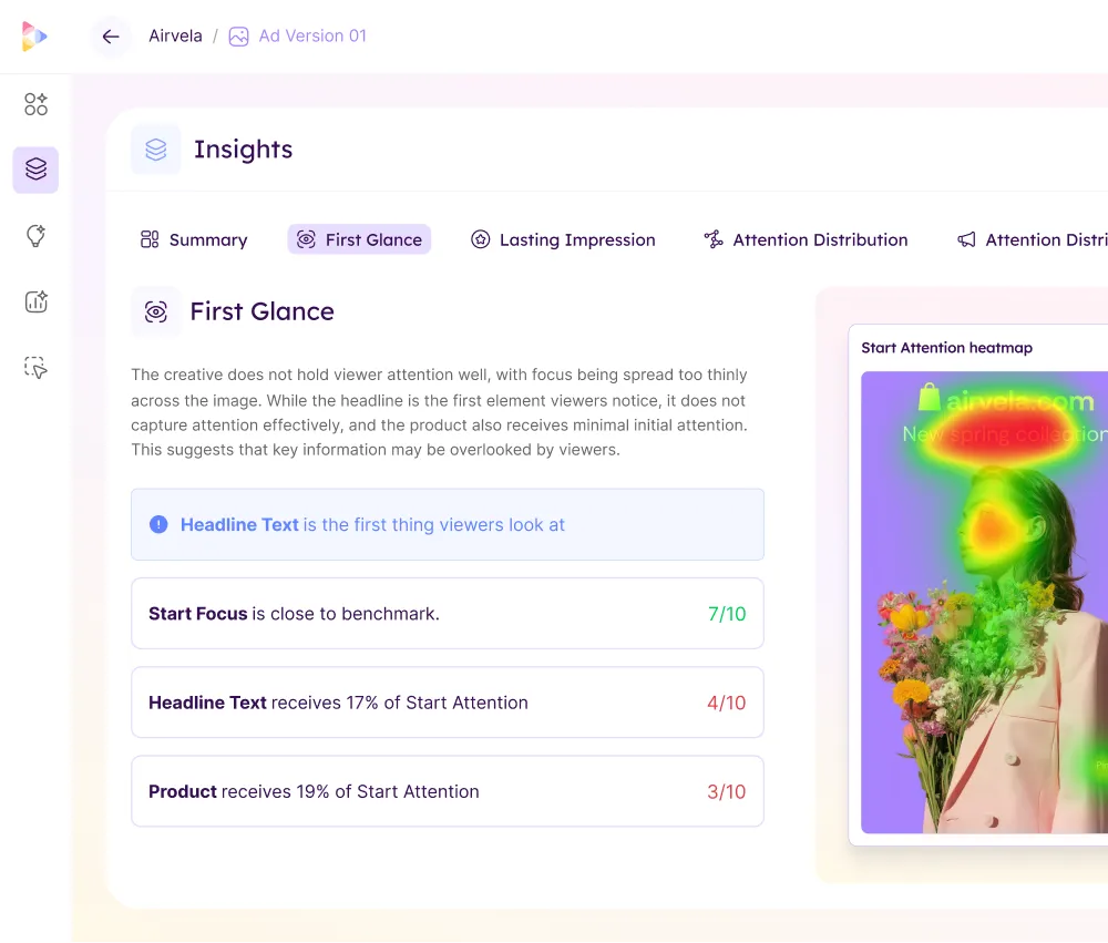
An example from Neurons' work
Most research on this has been performed by using eye-tracking in a stationary, controlled lab environment. One outstanding question is whether the same is at stake for more realistic real-life situations. Here, by going through the Neurons database of thousands of eye-tracking recordings, we can indeed confirm that the corner of Death is a substantial factor to be reckoned with. An example can be found below.

The findings suggest that directional reading bias should be taken into consideration in web design, online advertising, and search patterns in an international marketing context. It also indicates the importance of running a pre-test for advertisements before launching a campaign to make sure everything would be seen and comprehended as it is supposed to be.
Further reading
- Hernandez, Monica D.; Yong Wang; Hong Sheng; Kalliny, Morris; Minor, Michael (2017) "Escaping the corner of death? An eye-tracking study of reading direction influence on attention and memory", Journal of Consumer Marketing, Vol. 34 Issue: 1, pp.1-10, https://doi.org/10.1108/JCM-02-2016-1710
- Hill, Dan (2010), “The 6 Secrets Of Eye-Tracking”
- Outing, S. and Ruel, L. (2006), “The best of eyetrack III: what we saw when we looked through their eyes”, Eyetrack III, available at: https://www.zenpages.org/wp-content/uploads/eyetrack_iii.pdf